A New Company, A New Brand
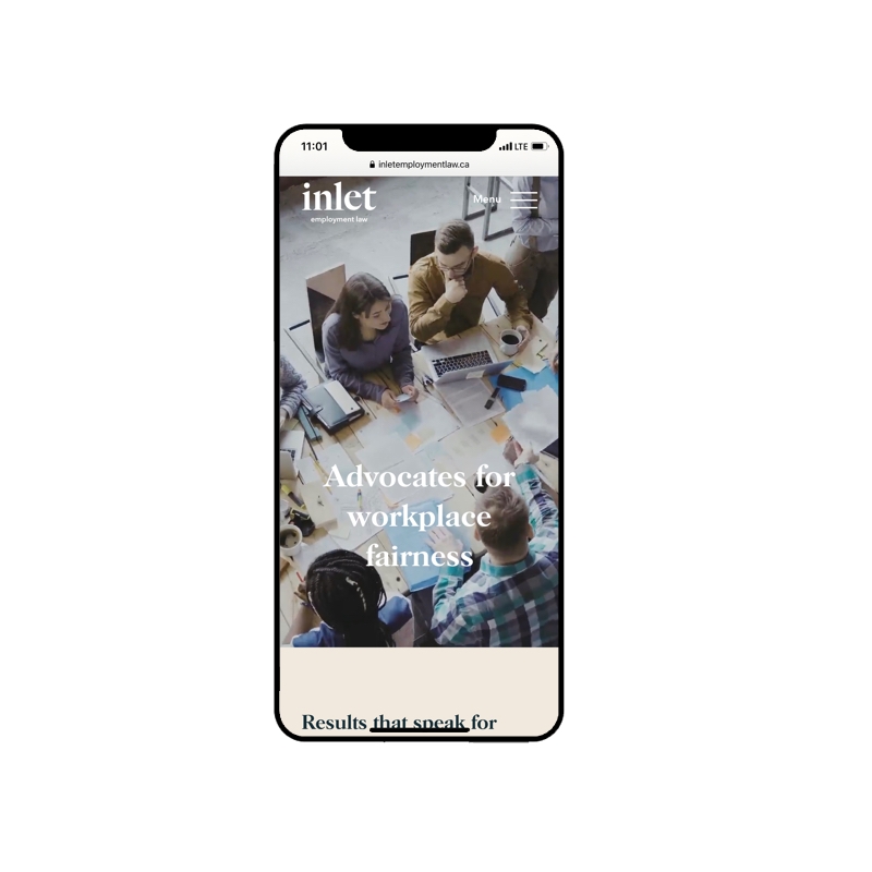
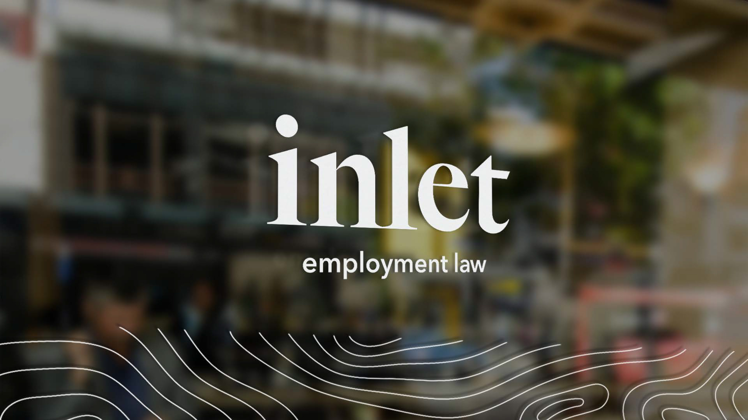
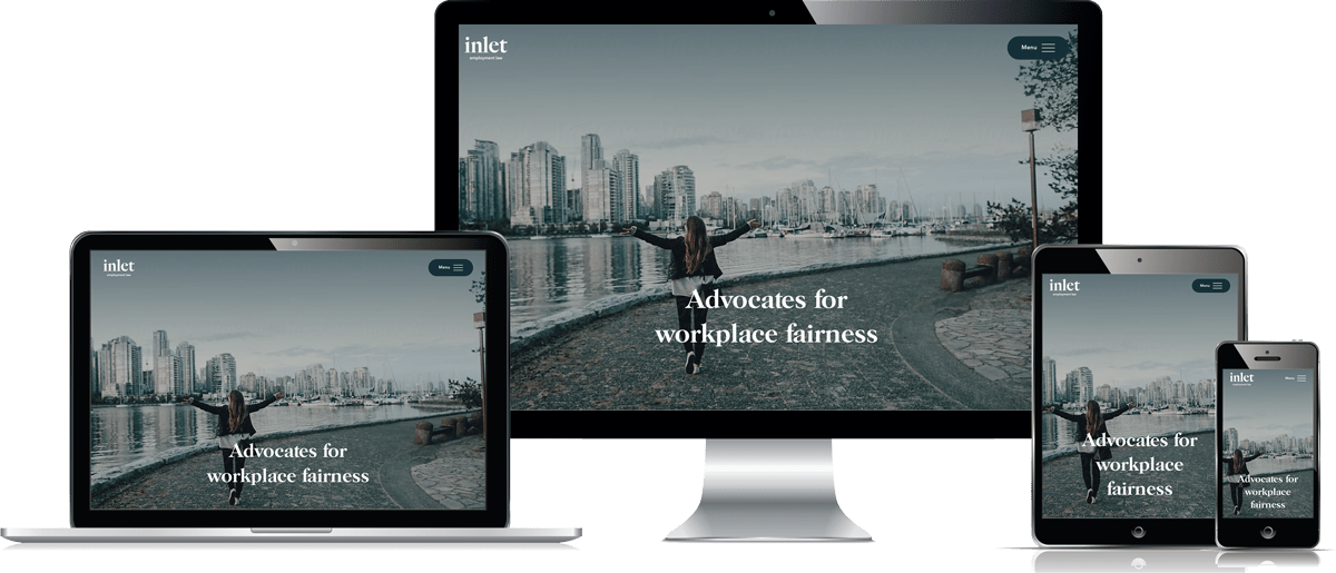
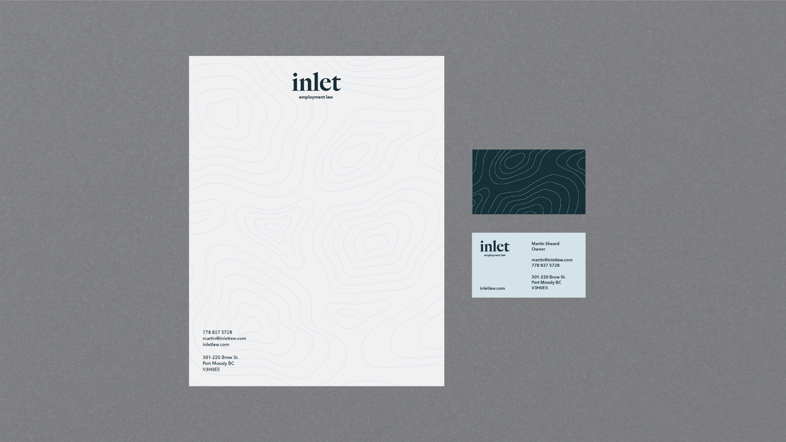
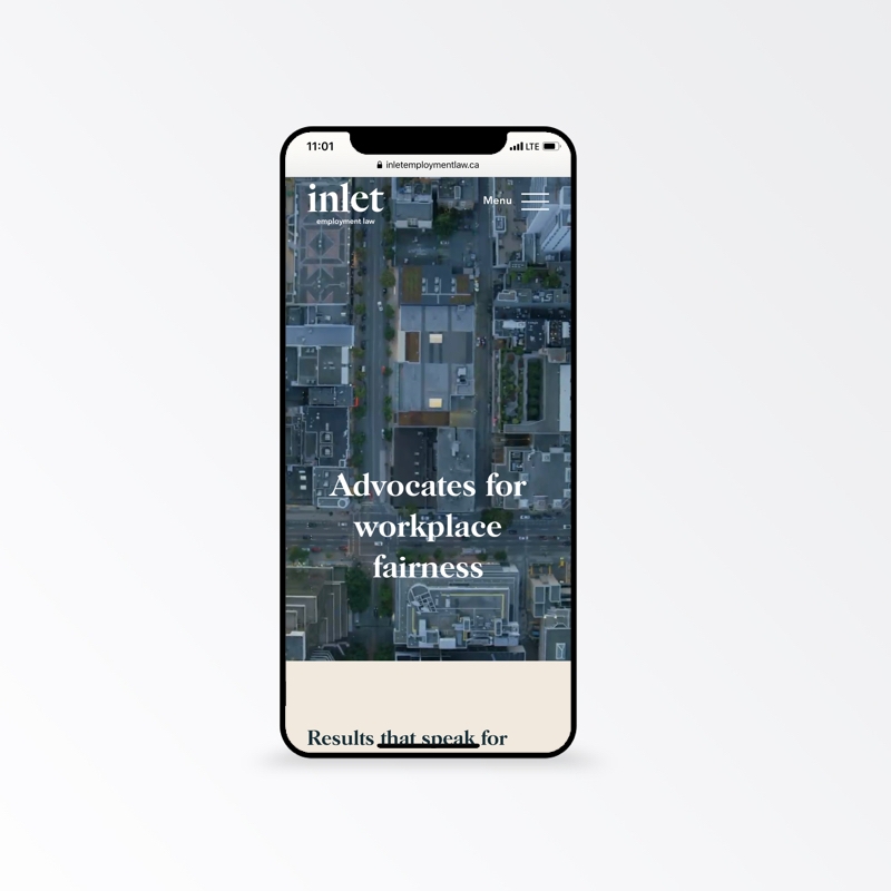
Right away, we knew Inlet had to be an inviting brand. Not only is this a description of its founder's personality, but it sits in the name "Inlet" itself. People reaching out to employment law firm are often going through some sort of personal crisis. Clients needed to know they were coming somewhere they would be well listened to. Thus we leaned into the soothing, pleasant elements of water - it was worked into the colour scheme, to the custom topographical patterns, to video of crashing waves found on the website.
Now, on the same token, the brand isn't - and shouldn't be - solely warm and peaceful. Its founder is one of the most experienced and fearless employment lawyers in British Columbia. We needed to evoke that level of experience, confidence, and sophistication - so an elegant sans-serif font was selected to give the brand an elevated, editorial feel. Imagery was carefully curated to give off a big magazine aesthetic. Lastly, we introduced a warm beige to call up elements of institutional maturity.

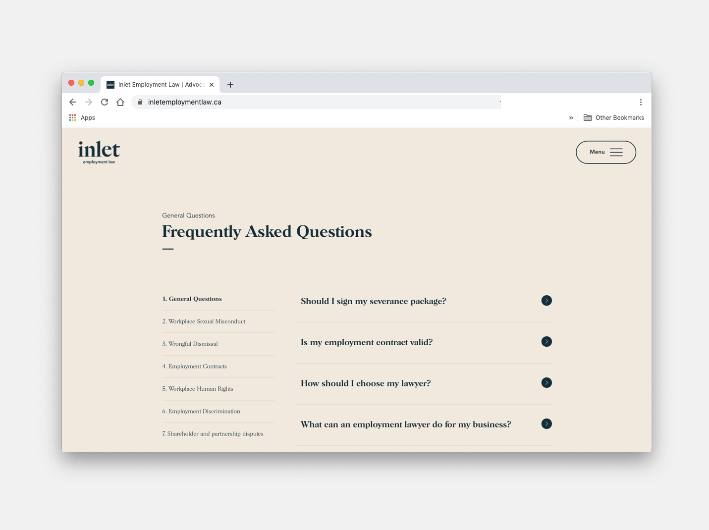
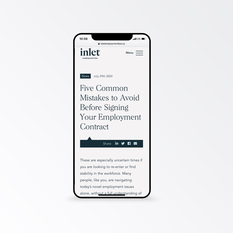
A simplicity approach to website design
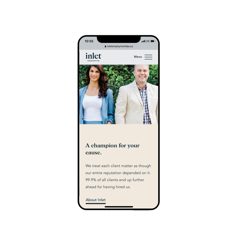
Legal professionals have an uncanny ability (and willingness!) to absorb dense bodies of text. Generally, however, their clients do not. With this in mind, our designs were based off of a word pool of "simplicity", "concision", and "digestible". We used beautiful and quick, to the point headers. We made sure text was broken up and never overwhelming. And we used clean, beautiful imagery strategically throughout the website.
Happy Client
These guys built me a beautiful website. They brought a little extra to the table too. They had great design ideas and were super-responsive. I can't imagine having a better experience and recommend their services enthusiastically.Martin Sheard // Founder